PULSE
Turning free features into premium value via UX design


The Problem
My client wanted to convert their free music app to a freemium model. I had to retain the app’s existing free user base, effectively highlight the added value of premium features, and ensure that the upgrade path was clear, persuasive, and frictionless to maximize conversions.
Role: UI/UX Designer
Process: Project Planning, Competitive Analysis, User Flows, Sketching, Wireframing, Branding, Prototyping, Usability Testing
Timeline: 80 Hours
Tools: Figma/Figjam

The (other) Problem
The brief for this project was that my “client” already had a successful app that I was simply transitioning to a freemium model. My efforts, therefore, were primarily on the UX design of freemium conversion. In reality, I was not provided a free app to transition. I had to fully design and brand said app that I could then use to stage my freemium UX design process. Fully considered music app design is not the focus of this case study, but it was a secondary task that had to be considered throughout.
Research
With only 80 hours to complete this project, I made a strategic decision to delay initial user interviews in favor of conducting them later in the process, when they could serve both as research and as feedback on early design concepts. That said, I did not compromise on research. I began with a competitive analysis of Spotify, YouTube, and Dropbox to evaluate the strengths and weaknesses of their freemium models. My key takeaways were:


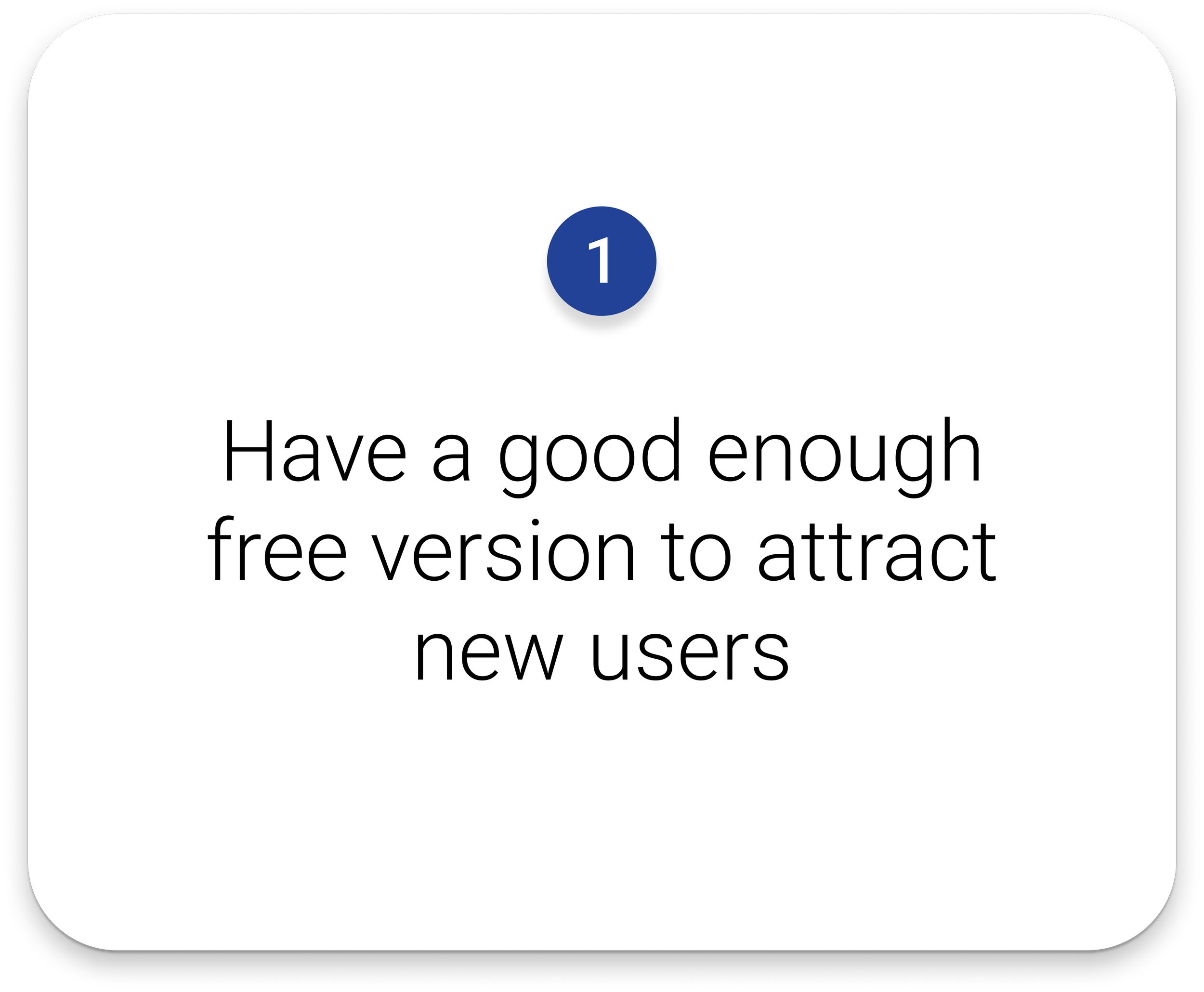
In addition to my own insights about what existing freemium media apps were doing well, I also consulted the Harvard Business Journal for some more core features of effective freemium designs. These core principles, as well as the themes from my competitive analysis, would be considered throughout my design process:


Finally, I conducted research on who my actual user would be, and what their needs were. The user for music media apps is effectively everyone, so clear navigation, robust search functions, and effective controls were essential. These would ensure the user could listen the way they want, and then over time, progressive personalization would make it easier to cater to a specific individual.
I also needed to understand what features users considered valuable enough to pay for. The top 3 motivations for upgrading were: no ads, control over listening, and increased access to songs. Some commonly reported experiences that helped push users over the hump to upgrade included access to free trials or a friend's premium account.
Mapping it Out
With my foundation established, I started mapping out user flows. I prioritized making sure that every path had a way to feed into the upgrade flow. In later design steps I simplified many of the flows from this initial map, but this was a valuable starting point for organizing all the necessary features, and beginning the breakdown of logged out vs free vs premium states of the design.

Sketches and Features
Next, I finalized the features list of the app. To quickly create my mock music app, I combined the best regarded features of competitors with some of my own ideas, to make a suitable product to showcase the freemium conversion.
Music app design was not the priority of this project, but I still felt mine needed more unique features to differentiate itself. I would circle back to this concern later in the project.
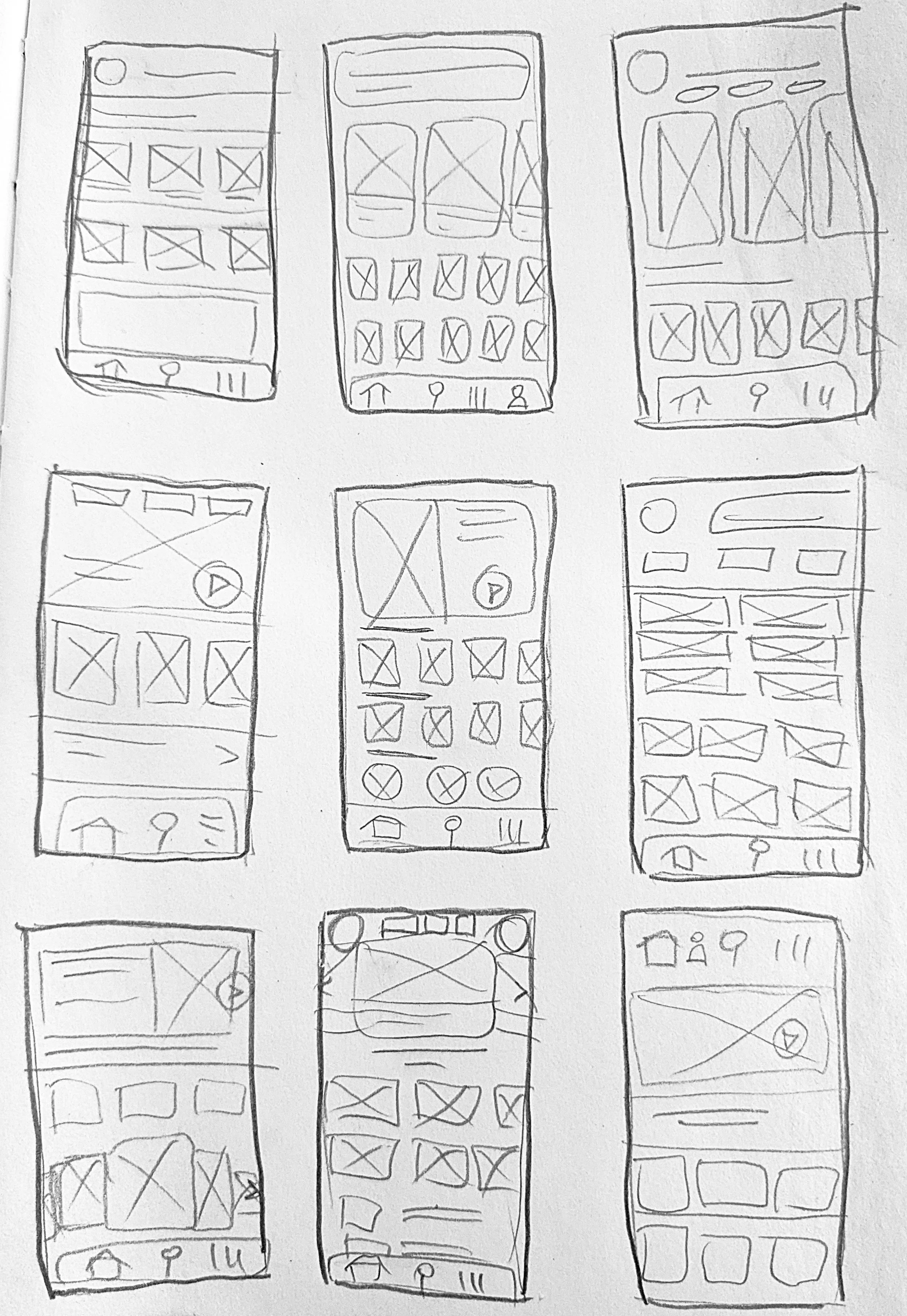
For now, I moved onto sketches to start rapidly brainstorming and visualizing. The sketches were kept very loose to facilitate the free flow of ideas.
The Solution
My goal was to offer enough value for free, clearly highlight the benefits of upgrading, make upgrading easy, and use incentives to drive conversions. Some featured design decisions I made to achieve these goals included:
Value-Driven Ads:
Ads highlighted appealing features (“Want to Listen Offline?”) and upgrade prompts appeared at high-attention moments—like during ad breaks or when users interacted with premium features.
Strategic Limitations:
I limited skips, on-demand playback, and ad-free listening—top reasons users cited for upgrading—while still offering a functional free experience.
Gradual Feature Exposure:
Users started with limited access, then unlocked more (e.g., playlist creation) after signing up. Eventually, they were offered premium features with a free trial, increasing the chance they’d upgrade—either during or after the trial.


Usability Testing
With some wireframes blocked out, it was finally time to get the users involved! I ran a dual interview/usability test session to gain the most insight. Users completed all tasks easily and felt upgrading was worthwhile, but some key improvements included:
Improved Ads:
Wordy ads were ignored, so I reduced banners, made prompts more concise, and emphasized locked premium features, which users found more engaging.
Personalization First:
Users wanted personalized recommendations over popular recommendations. They also asked for more control over certain features, like selecting specific artists for the “More Like This Artist” section.
I reorganized screens, added features, and moved into visual development.

Branding
As I refined my features and layouts based on feedback, it was also time to start addressing the visual identity of this app. The company was described as "smart, hip, and bold" as well as "uniquely diverse, but somehow always familiar."
I chose a blocky bold typeface that had a little attitude, while being highly readable. The app would be visually busy with imagery, so the main colors were neutral. The secondary colors were inspired by the iridescence of CDs, and the whole palette was rigorously accessibility tested. I used closeups of CDs and vinyl records as backgrounds and to add texture.

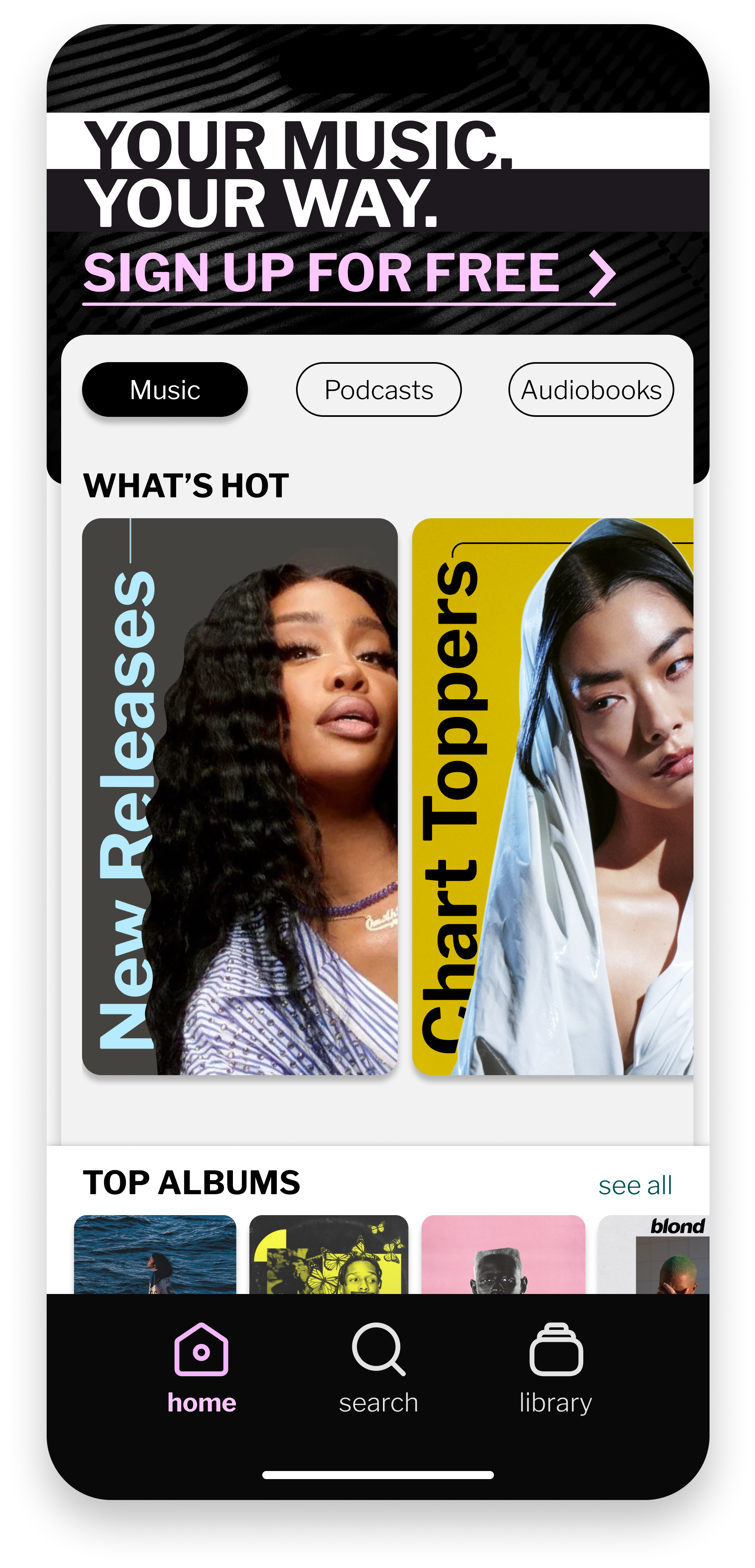
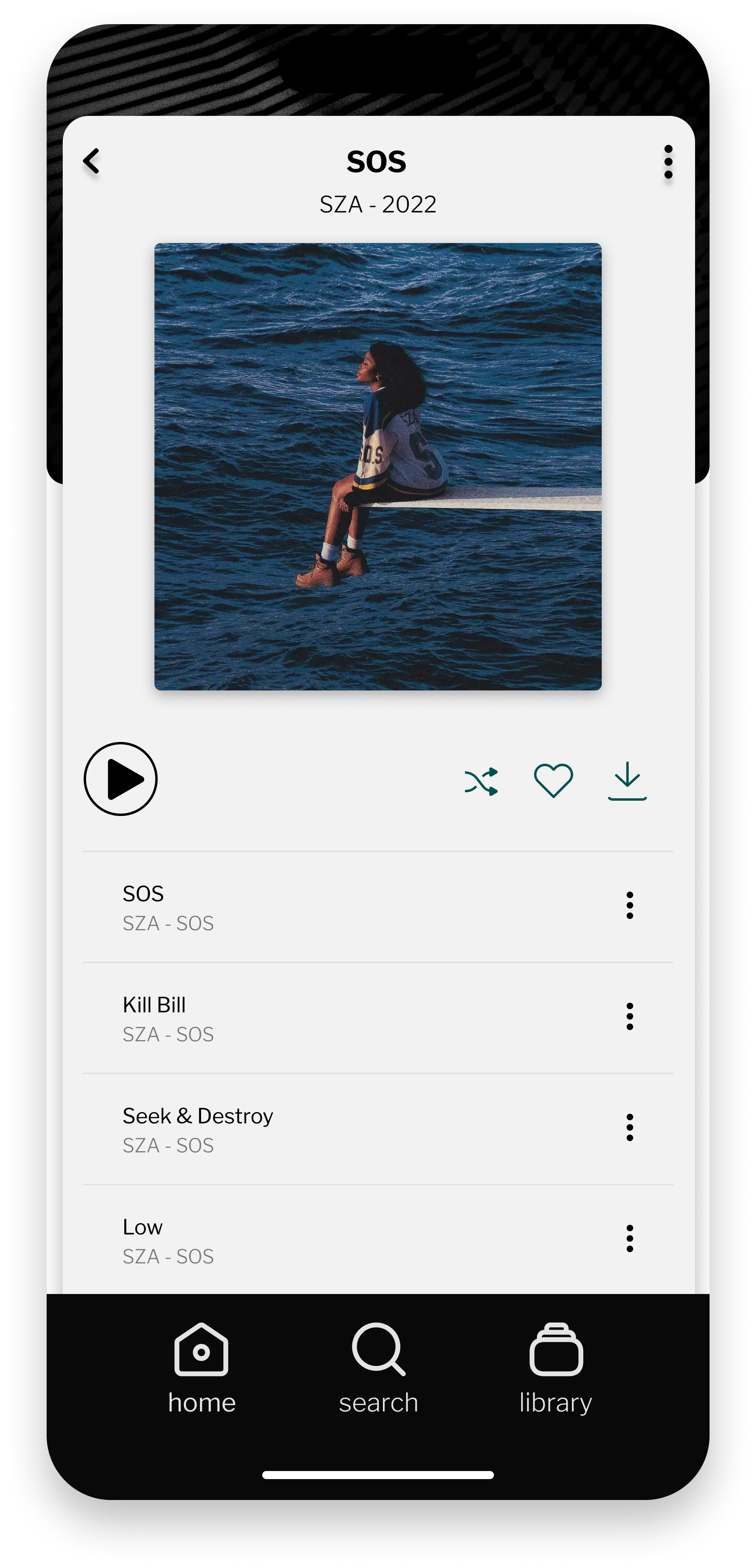
High Fidelity Design
My main goal was to provide a clean stage for the music and art to shine. The app has a subtly cool vibe but is neutral enough to look good for a user who only listens to classical piano, as well as one who likes EDM. I prototyped the high-fidelity mockups and brought them back to my users for a final round of validation. The prototype is below, Please full screen to interact.
Final Testing
And with this visually polished prototype, it was time to go back to the users! Tests were overall positive, but again, key feedback emerged.
Users liked the friend-based features (e.g., song recommendations) but needed clearer friend management (adding/removing). There were also requests for more customization.
This sparked ideas to strengthen the app’s identity, but major changes would’ve been out of scope for this stage and the freemium focus—so I’ll cover them in the “Next Steps” section.
I did implement visual feedback improvements, enhanced friend features, and refined the overall design.
Below are some of the final designs.


The Results
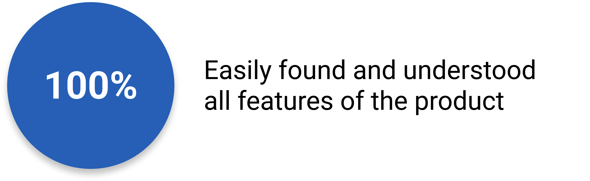
The final prototype tested well—90% of users said they’d consider upgrading. While the price wasn’t real, the response showed they saw strong value in the features. Many were also eager to involve friends, either for social features or referral perks.


Takeaways
Designing across three app states made Figma components essential for consistency, faster prototyping, and animated elements. It was also great practice in time management—working within constraints taught me to make solid decisions quickly and stick to them.
Next steps
Thank you for making it to the end of this case study! One thing I would address if I continued this project is the complete lack of branding. Currently there are no logos, no name headers, no branding anywhere.
Additionally, this app lacked unique features compared to other music streaming apps. Based on requests for more friend functionality and customization, I would like to add an almost MySpace-ish level of personalization. Users could customize their profile and playlists, save different layouts for interfaces, follow artist profiles and purchase cosmetics exclusive to those artists (providing incentive for artists to partner with PULSE), and more. It could give PULSE an edge when appealing to people that want extra self-expression. Sharable curated content could also offer an advantage for reaching new users. Of course, this would all have to be heavily researched and tested.