HealthHorizon
Improving America’s relationship with healthcare, one download at a time.


The Problem
The problem at the heart of HealthHorizon is the widespread underutilization of preventive healthcare services in America. I set out to to engage Americans, especially those who aren’t already proactive about their health, by making preventive care more accessible, understandable, and convenient.
Role: UI/UX Designer
Process: Competitive Analysis, User Interviews, Affinity Mapping, Persona Creation, Site Mapping, Branding, Wireframing, Mockups, Prototyping
Tools: Figma, Miro
Researching the Big Picture
To begin, I reviewed government studies, scientific articles, and medical journals in order to get a "big picture" understanding. If I wanted to design for a user base that consisted of the entire adult population of the United States, I had to understand how this issue affected users beyond my own limited sphere. The recurring themes as to why Americans were not accessing preventive services included:


So why aren’t existing solutions solving the problem?
Many tools addressed these themes as individual issues, but none took a holistic approach. For instance, Zocdoc helps people find providers, but only if they're already looking, and it doesn't address other concerns that might stop them from booking. HealthHorizon needed to find a way to attract the many Americans not already actively managing their health and then make access barrier free.
Gathering Insight in User Interviews
Interviews confirmed the pain points I had found in my initial research, but more importantly, they recontextualized vague themes into addressable experiences.
Instead of “things are too expensive, I can't afford them,” I heard, “being unsure what things cost is really worrying,” or “it’s scary to think about getting stuck with a big bill if you end up agreeing to anything out of your insurance network.”
Things like cost and scheduling were still large barriers, but they were not unapproachable monoliths.

Defining the User
So, who was the person I was trying to serve? What made them tick? “Health-Conscious Hannah” is a young professional with a lot on her plate. She would like to feel more confident about her health, but it is simply not a priority when juggling work, friends, school, bills, etc. If preventive healthcare is going to have a place in her schedule, it needs to be as convenient as possible and should feel productive.

Understanding Hannah was key to my design. I came back to her repeatedly during the process to remind myself that preventative care was not exciting for her. Anything I wanted her to engage with had to be streamlined into a process that was respectful of her time.
This eliminated some of my initial design ideas, such as a form of gamification. Asking users to spend time and money preventing health problems they don't even have yet is already a huge ask, I needed to respect their actual priorities and help them get this done efficiently so they could go spend time on things they truly care about.
Turning Problems into Solutions
So now that I understood my user, how could I help her? My solution centers a few core features: incentivized care plans, robust provider search, and seamless appointment scheduling.
PROBLEMS
Unsure which appts to make
Unclear on value of appt
Lack motivation to make appt
SOLUTION
Robust search that lets you sort and filter by your personal priorities


RESULTS
-Reduced mental fatigue
-More confidence in choice of provider
-More likely to follow through
SOLUTION
Personalized care plan with redeemable rewards for completing plan objectives


PROBLEMS
-Forget about appts
-Hard to track appt history
-Anxiety about going to appts
RESULTS
-Reduced mental strain from appt tracking
-Better prepared for appts
-Easy to track and reference health history
RESULTS
-Clear and easy jumping off point
-Better understanding of the value of each appt
-Incentives for less health motivated users
PROBLEMS
Tired of juggling multiple tools to find provider availability, reviews, insurance, etc.

SOLUTION
In-app appt scheduling, history, and management, with reminders and checklists for what to expect at each appt
It's crucial to keep the entire journey—from deciding to book an appointment to showing up on the day—as simple and seamless as possible to minimize user drop off. In addition, this solution aims to address the systemic cultural lack of appreciation for preventative health care by not only making preventive care more convenient but also fostering a deeper understanding and appreciation for its value and effects.
Initial Designs
With my key features in mind, I created the site map, defined red routes to develop further (scheduling an appointment, adding a health provider to your team), and fleshed them out into low fidelity wireframes.


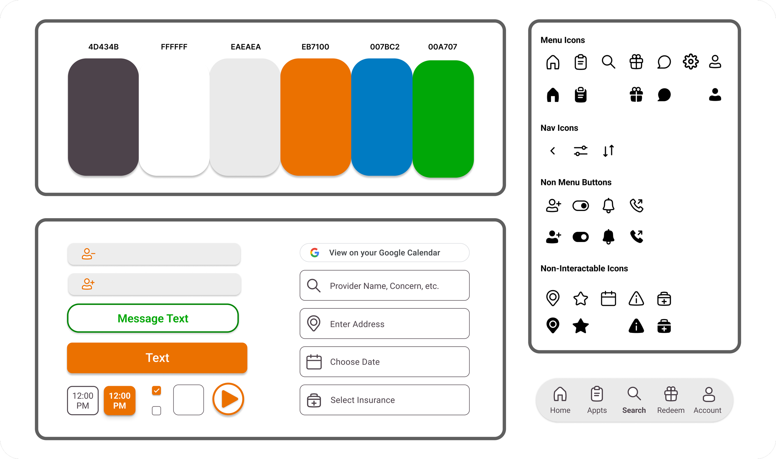
I also began developing the brand and personality of the product, to make sure users would immediately feel welcome and supported as they explored the app’s features. I decided on the name HealthHorizon, to evoke the idea of looking ahead. The branding is warm, approachable, and professional. The bright orange embodies energy, positivity, and motivation, as I felt it was important to avoid a sterile, clinical feel.
I made sure to test the color palette for accessibility and sufficient contrast ratios. No design should ever neglect accessibility, but it would be completely unacceptable to overlook it in the healthcare sphere.
High Fidelity Prototype
I then put it all together, visually developed and prototyped my wireframes, and took them back to my users for more testing.
The Results
In the initial round of user interviews, I had asked participants to rate the difficulty of scheduling preventive care appointments on a scale of 1 to 10. In the final round of testing, I asked them to rate the difficulty again, this time, after using the tool.
The average difficulty went from a 7.8, down to a 3.5 average. In addition, 100% of users indicated that HealthHorizon made them significantly more motivated to engage with preventative care.


We must take these results with a certain grain of salt as this is not a market tested product and people’s actions often differ from their words, but from what was recorded, user attitudes were markedly improved.
Final Design and Thoughts
The culmination of my research, synthesis, designing, and refining is below. I learned a lot from this project, and prioritized my user from beginning to end.
Moving forward, I would be sure to flesh out management of the user's care plan, or the redemption of reward points, as these elements are what makes my solution unique. I would also be sure to implement the provider side interface, where doctors could manage their availability, profiles, and more. I am truly passionate about this problem space and would love to one day finish this tool to serve a greater purpose than making for a nice case study.
Thank you for reading all the way to the end of this story, and please feel free to click through the rest of my case studies further down or reach out to me directly!